
Sherwin-Williams Upward: Undertones, Lighting, and Examples

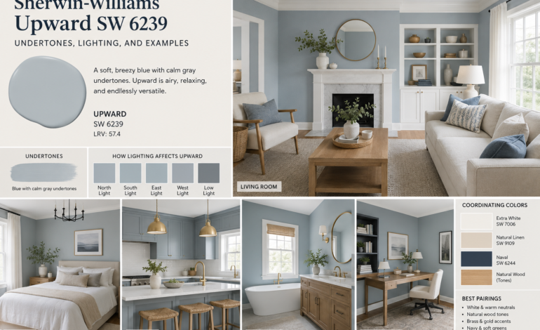
Choosing the right paint color can completely change the appearance and atmosphere of a room. A shade that looks soft and airy in one space may appear noticeably cooler, grayer, or bluer in another. This is especially true with light blue-gray colors, where natural and artificial lighting can dramatically influence the final appearance.
One shade that continues to attract attention is Sherwin-Williams Upward SW 6239. Originally selected as Sherwin-Williams’ 2024 Color of the Year, Upward is a soft, breezy blue designed to create a calm and uplifting atmosphere. Sherwin-Williams describes it as a denim blue with calm gray undertones, making it more versatile than many traditional blue paints.
But what does Upward actually look like on a wall? What are its undertones? Does it work in rooms with little natural light? How does it change throughout the day? And which furniture, trim, and accent colors work best with it?
This guide explores SW Upward undertones, Upward paint color lighting, Sherwin-Williams Upward examples, and an honest Sherwin-Williams Upward review to help you decide whether this popular blue-gray belongs in your home.
What Is Sherwin-Williams Upward SW 6239?
Sherwin-Williams Upward SW 6239 is a light, muted blue from the Sherwin-Williams blue color family. It has a soft, relaxed character rather than the strong or saturated appearance associated with traditional blue paint.
Sherwin-Williams introduced Upward as its 2024 Color of the Year, describing it as a breezy blue intended to evoke peace, openness, and the feeling of a clear summer sky.
Unlike a bright baby blue, Upward has enough gray in its formulation to make it feel sophisticated and livable. That gray component also helps the color work with neutral interiors, natural wood, white trim, stone surfaces, woven textures, and contemporary furniture.
According to Sherwin-Williams, the official color data lists Upward with an LRV of approximately 57.4. Its RGB values are approximately 191 red, 201 green, and 208 blue, which confirms its position as a relatively light blue-gray shade.
The result is a color that can feel:
- Soft
- Airy
- Calm
- Muted
- Contemporary
- Coastal
- Relaxed
- Slightly cool
- Sophisticated
However, paint should never be judged from a digital color chip alone. The surrounding finishes, natural light, artificial bulbs, flooring, furniture, and nearby colors can all influence how Upward appears.
Understanding SW Upward Undertones
One of the most important things to understand before using this color is its undertone.
The primary SW Upward undertones are gray, with the overall color reading as a soft blue-gray. Sherwin-Williams specifically describes Upward as a denim blue with calm gray undertones.
This gray influence is what keeps Upward from looking like a traditional bright blue.
Is Upward Blue or Gray?
Upward is fundamentally a blue paint color, but its gray component can become much more noticeable depending on lighting.
In bright natural light, the blue character generally becomes easier to recognize. In a darker room, the color can appear more subdued and gray.
This explains why homeowners can have very different reactions to the same shade.
One person may see:
Soft blue
Another may see:
Blue-gray
And someone else may see:
Muted gray with a blue cast
All three observations can be reasonable because paint color is affected by the environment surrounding it.
Does Upward Have Purple Undertones?
Some people may perceive a faint violet or periwinkle quality in particular lighting conditions. However, the most reliable description from Sherwin-Williams is a blue with calm gray undertones rather than a strongly purple-based blue.
If you are particularly sensitive to purple undertones, testing Upward in your actual room is important.
Place a large sample near:
- White trim
- Wood flooring
- Gray furniture
- Beige furniture
- Natural stone
- Warm lighting
- Cool lighting
This will help you see whether the color works with the existing undertones in your home.
Sherwin-Williams Upward LRV and Why It Matters
Light Reflectance Value, commonly called LRV, describes how much visible light a color reflects. The scale generally runs from very dark colors at the lower end to very light colors at the higher end.
Sherwin-Williams lists Upward with an LRV of approximately 57.4.
This places it comfortably in the light-to-medium range.
That matters because Upward is not an extremely pale blue. It has enough depth to remain visible on a wall while still providing an open and relatively airy appearance.
A higher-LRV color can help a room feel brighter, but LRV should not be confused with actual brightness. A room with small windows and poor artificial lighting can still make a light paint color look darker.
This is why understanding Upward paint color lighting is essential.
How Lighting Changes Sherwin-Williams Upward
Lighting is one of the biggest factors affecting any paint color.
The same wall painted with Upward can look different in the morning, afternoon, evening, and under artificial light.
Upward in Bright Natural Light
When exposed to strong natural daylight, Upward can look noticeably blue and airy.
The gray undertone helps prevent the color from becoming overly intense. Instead, the wall can take on a soft sky-blue appearance.
This makes Upward especially attractive in:
- Sunrooms
- Bedrooms with large windows
- Living rooms
- Kitchens
- Open-plan spaces
- Coastal-style interiors
Bright daylight can also make the room feel larger and more refreshing.
Upward in North-Facing Rooms
North-facing rooms typically receive cooler and less direct natural light.
Because Upward already contains blue and gray characteristics, this type of lighting can make the color appear cooler and grayer.
In some spaces, this is exactly what homeowners want.
However, if your goal is a warm and cozy room, Upward may need to be balanced with warmer furnishings and lighting.
Consider using:
- Warm white bulbs
- Natural wood
- Cream textiles
- Brass hardware
- Beige rugs
- Warm artwork
- Woven baskets
These details can prevent the room from feeling overly cool.
Upward in South-Facing Rooms
South-facing rooms usually receive stronger, warmer natural light.
This can be an excellent environment for Upward because the warm sunlight can balance the cool qualities of the blue-gray paint.
Sherwin-Williams itself identifies Upward as a suitable choice for south-facing rooms because its cooler character can balance the warmth of southern light.
In this setting, Upward may appear:
- Softer
- Brighter
- More blue
- Less gray
- More energetic
If you have a room with abundant sunlight, Upward can create an especially airy atmosphere.
Upward in East-Facing Rooms
East-facing rooms receive stronger morning light.
In the morning, Upward may look bright, fresh, and distinctly blue. Later in the day, when direct sunlight decreases, the gray component can become more noticeable.
This makes east-facing rooms interesting because the paint can subtly evolve throughout the day.
Bedrooms, breakfast rooms, and home offices can benefit from this changing appearance.
Upward in West-Facing Rooms
West-facing rooms tend to receive warmer afternoon and evening sunlight.
The warmer light can soften the coolness of Upward and make it appear more balanced.
During earlier hours, the shade may look relatively muted and blue-gray. In late afternoon, golden sunlight can give it a warmer and slightly brighter appearance.
Upward Under Artificial Lighting
Natural daylight is only half the story.
Artificial lighting can significantly change how a blue-gray paint looks after sunset.
Warm White Bulbs
Warm bulbs can add a subtle golden influence to Upward.
This can make the walls feel softer and less cool.
If your home has warm lighting, Upward may work beautifully with:
- Oak
- Walnut
- Natural maple
- Beige upholstery
- Cream curtains
- Brass fixtures
- Tan leather
Cool White Bulbs
Cool or daylight-style bulbs emphasize the blue and gray characteristics.
As a result, Upward can look cleaner, cooler, and more contemporary.
This may work well in:
- Modern offices
- Bathrooms
- Contemporary kitchens
- Minimalist interiors
However, too much cool lighting in a room that already lacks warmth can make the space feel sterile.
The Best Lighting for Upward
There is no single “correct” lighting temperature for this color.
If you want a relaxed and comfortable atmosphere, warm-to-neutral white lighting is usually easier to combine with Upward.
The key is balance.
Rather than choosing your light bulbs after painting, consider the lighting and paint color together.
Sherwin-Williams Upward Review: Is It a Good Color?
A balanced Sherwin-Williams Upward review should recognize both its strengths and limitations.
What Makes Upward Attractive?
The biggest advantage is versatility.
Upward is colorful enough to provide personality but muted enough to function almost like a neutral in many interiors.
It does not demand that every piece of furniture match it.
Instead, the gray component gives designers plenty of flexibility.
Upward can complement:
- White
- Cream
- Beige
- Gray
- Natural wood
- Black
- Brass
- Soft green
- Navy
- Warm neutrals
Sherwin-Williams currently recommends coordinating Upward with colors including Icicle SW 6238, Extra White SW 7006, and Natural Linen SW 9109.
Where Upward Can Become Challenging
The biggest potential issue is lighting.
In a dark room, Upward can lose some of its airy blue appearance and become more gray or muted.
Real-world homeowner discussions also show that people can experience Upward differently in low-light areas, with some finding it cooler and grayer than expected.
This does not necessarily mean the paint is a bad choice.
Instead, it demonstrates why sampling is so important.
If your room has limited windows, dark flooring, cool LEDs, or large gray furniture, Upward may appear considerably cooler than it does in promotional photographs.
Sherwin Williams Upward Examples by Room
One of the easiest ways to understand this color is to imagine how it behaves in different rooms.
1. Upward in the Living Room
A living room is one of the best places to consider Upward.
Its soft blue character can provide color without dominating the space.
Pair it with:
- White trim
- Light oak furniture
- Cream sofa
- Natural fiber rug
- Black accents
- Soft beige curtains
For a coastal-inspired room, add woven baskets, linen cushions, light wood, and simple artwork.
For a modern room, combine Upward with clean white surfaces, black accents, and streamlined furniture.
Sherwin-Williams has featured Upward in living spaces as part of its Color of the Year presentation, emphasizing its relaxed and breezy character.
2. Upward in the Bedroom
Upward is particularly well suited to bedrooms because its muted blue quality can create a peaceful atmosphere.
Use it on all four walls for a soft cocooning effect, or combine it with white trim and a lighter ceiling.
Bedroom combinations can include:
- Upward walls
- White ceiling
- Natural wood bed
- Cream bedding
- Beige rug
- Warm lamps
The result is calm without feeling completely neutral.
3. Upward in the Bathroom
Bathrooms are another natural application.
Blue is already associated with water, freshness, and cleanliness, making a muted blue-gray an intuitive choice.
Upward can look especially attractive with:
- White tile
- Marble
- Brushed brass
- Chrome
- Natural wood
- White countertops
For a small bathroom, use strong lighting so the color does not become overly gray.
4. Upward in the Kitchen
Upward does not have to be limited to walls.
It can also be considered for kitchen cabinetry.
A kitchen with Upward cabinets can create a softer alternative to navy, sage, or traditional gray.
Pair it with:
- White countertops
- Marble backsplash
- Natural wood
- Brass hardware
- Warm white walls
Sherwin-Williams’ 2024 Color of the Year presentation included kitchen applications featuring Upward alongside light surfaces and natural textures.
5. Upward in the Home Office
For a home office, Upward can provide color without being visually overwhelming.
The blue-gray quality can create a professional backdrop for:
- White desks
- Wood shelves
- Black hardware
- Green plants
- Neutral artwork
If your office has limited natural light, prioritize layered lighting.
A ceiling fixture alone may not be enough. Add a desk lamp or wall lighting to prevent the paint from appearing too dark.
6. Upward on Doors and Trim
Although white trim is the classic choice, Upward can also be used more creatively.
A door painted Upward can become a subtle statement feature.
For example:
White walls + Upward door + natural wood
creates a warm, contemporary look.
You can also use Upward on built-ins, cabinets, or selected millwork rather than covering every wall.
Best Colors to Pair With Upward
The right companion colors can either emphasize Upward’s blue character or balance it.
Extra White
Sherwin-Williams lists Extra White SW 7006 as a coordinating color.
This combination produces a crisp, clean appearance.
Use Extra White for:
- Trim
- Doors
- Ceilings
- Cabinets
Natural Linen
Natural Linen provides more warmth.
Because Upward can feel cool in certain lighting, a warm neutral such as Natural Linen can create a balanced palette.
This is particularly useful if you prefer a relaxed transitional or organic style.
Soft Beige
Beige furniture and accessories can warm up Upward without competing with it.
Think:
- Beige sofas
- Tan leather
- Jute rugs
- Cream curtains
Natural Wood
Natural wood is one of the easiest ways to make Upward feel warmer.
Oak, maple, walnut, and other wood tones can create an attractive contrast with the soft blue-gray wall color.
Dark Navy
For more contrast, combine Upward with a deeper navy.
The darker blue creates visual depth while keeping the palette within the same general color family.
Black
Black accents can give Upward a more modern appearance.
Try black:
- Light fixtures
- Door hardware
- Picture frames
- Cabinet handles
- Furniture legs
The contrast prevents the room from looking too pale.
Upward With White Trim
White trim is one of the safest combinations.
However, the exact white matters.
A bright, clean white can make Upward appear bluer by comparison.
A warmer white can soften the contrast.
If your home already has white trim, sample Upward directly beside it rather than evaluating the paint in isolation.
This is especially important because surrounding colors can influence perceived undertones.
Is Upward Too Blue?
For homeowners who normally prefer neutrals, this is a common concern.
The answer depends on the room.
In bright natural light, Upward can definitely read as blue. However, its gray undertones keep it from becoming overly saturated.
If you want a room with almost no color, Upward may feel too blue.
If you want a subtle color that still behaves somewhat like a neutral, it can be an excellent choice.
Is Upward Too Gray?
The opposite concern is also possible.
In low-light environments, the gray component can become more noticeable.
This is why a large sample should be tested on multiple walls.
A small paint chip cannot accurately show how the color will behave across a large wall in changing light.
Sherwin Williams Upward Examples: Design Styles
Upward is flexible enough to fit several decorating styles.
Coastal
This is perhaps the most obvious combination.
Use:
- White
- Linen
- Natural wood
- Woven textures
- Soft blue accessories
The result is relaxed and airy.
Scandinavian
Pair Upward with pale wood, simple furniture, white surfaces, and minimal decoration.
The gray component of the paint works naturally with Scandinavian simplicity.
Transitional
Combine Upward with traditional furniture, warm neutrals, white trim, and classic lighting.
This prevents the color from feeling overly contemporary.
Modern Organic
Use Upward with:
- Natural wood
- Stone
- Linen
- Rattan
- Cream
- Matte black
This creates a sophisticated connection between cool color and warm natural materials.
Modern Farmhouse
Upward can also replace more predictable farmhouse blues and grays.
Use it with white cabinetry, natural wood, black fixtures, and simple textiles.
How to Test Upward Before Painting
Never choose a whole-room paint color solely from an online photograph.
Instead, test a large sample.
Place it on different walls and observe it at:
Morning:
Look for how the first natural light changes the blue.
Afternoon:
Check whether the color becomes warmer or brighter.
Evening:
Turn on your regular lamps and ceiling lights.
Cloudy day:
Observe whether the gray undertone becomes stronger.
Also place the sample near permanent elements such as flooring, countertops, cabinets, curtains, and furniture.
This process is much more reliable than judging the color on a phone or computer screen.
Common Mistakes When Using Upward
Choosing It Without Considering Light
A color that looks perfect online may behave differently in your home.
Using Only a Tiny Swatch
Small samples do not always reveal how a paint will appear across an entire wall.
Ignoring Existing Undertones
If your flooring has strong yellow or orange undertones, the relationship between the floor and Upward can affect the overall appearance.
Using Only Cool Lighting
Cool LEDs can make a blue-gray room feel colder.
Forgetting the Ceiling
The ceiling influences the perceived color of the walls. A very cool white ceiling can emphasize Upward’s blue character.
Does Upward Make a Room Look Bigger?
Light colors can help a space feel more open, and Upward’s relatively light value contributes to an airy visual effect.
However, paint alone cannot physically make a room larger.
The effect is strongest when Upward is combined with:
- Good natural light
- Light-colored furniture
- Minimal visual clutter
- Reflective surfaces
- Light flooring
- White or pale ceilings
In a small room with limited light, strategic artificial lighting becomes equally important.
Is Sherwin-Williams Upward Still a Good Choice?
Although Upward was named Sherwin-Williams’ 2024 Color of the Year, it does not automatically become outdated when a new annual color is introduced.
Paint colors are not like short-lived fashion trends.
A versatile blue-gray can remain useful for years because it works with many design styles and materials.
Recent design coverage continues to include Upward among calming Sherwin-Williams colors, particularly for bedrooms and bathrooms.
Its continued appeal comes from the balance between color and neutrality.
It is blue enough to create personality but gray enough to remain sophisticated.
Final Sherwin-Williams Upward Review
Overall, Sherwin-Williams Upward SW 6239 is a versatile light blue-gray that works particularly well for homeowners who want a peaceful color without committing to a strong, saturated blue.
Its defining characteristic is the relationship between blue and gray.
In bright rooms, the blue can become more apparent and airy. In cooler or darker lighting, the gray component may become more noticeable. Warm southern light can soften the coolness, while north-facing rooms may emphasize its cooler side. Sherwin-Williams’ own lighting guidance highlights Upward as a useful choice for balancing warm south-facing sunlight.
The color is particularly attractive in:
- Living rooms
- Bedrooms
- Bathrooms
- Kitchens
- Home offices
- Entryways
- Cabinets
- Accent doors
- Open-plan interiors
It pairs naturally with white, warm neutrals, natural wood, stone, brass, black accents, and soft textiles.
The biggest caution is simple: test before committing.
Because SW Upward undertones respond strongly to lighting and surrounding colors, the version you see online may not be the version you see on your wall.
If you love soft blue, muted neutrals, coastal interiors, or modern organic design, Upward is worth sampling. Its light value, calm gray influence, and adaptable personality make it a practical choice for many contemporary homes.
Ultimately, the best Sherwin Williams Upward examples are not photographs from a catalog but real samples viewed in your own space throughout the day. Once you understand how Upward paint color lighting affects the shade, it becomes much easier to determine whether this breezy blue-gray is the right fit for your home.